Design a Readable Logo Stamp for Packaging
A packaging stamp has to work on the material you actually use, not just on a bright screen. This walkthrough uses a fictional small shop as an example. Use a logo you own or are licensed to reproduce and keep the mark separate from any certification or inspection claim.
Start with one job
Decide whether the mark should identify your shop, say thank you or show a handling instruction. For a fictional shop called Cedar Studio, a logo plus Cedar Studio and Handmade is enough. Adding an address, website and slogan to the same small stamp can make every line harder to read.
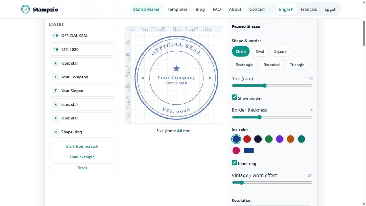
Build the layout in Stampzio
Choose a round or rectangular frame. Add your logo with the Image button and position it using the layer controls. Use a high-quality source with a transparent background when possible. Add a short text layer and leave space between the artwork and the border. Avoid enlarging a tiny raster logo.
Keep a clean production version
Choose one dark colour and reduce the worn effect while checking readability. Thin strokes, tiny reversed letters and fine gradients may not reproduce well as a physical ink stamp. Keep a simple master even if you also want a distressed image for digital mockups.
Test on the real material
Print a paper preview at the requested size and inspect the smallest text. Before ordering a physical stamp, discuss ink and surface suitability with the supplier: coated labels, cardboard and fabric behave differently. A screen preview cannot establish ink adhesion, drying time or the detail a manufacturer can produce.
Export and hand off
Save SVG for the supplier and PNG for a packaging mockup. Send the intended dimensions separately and ask for a production proof. Keep the mark truthful: decorative branding does not establish that a product is certified, inspected or legally approved.
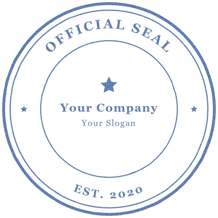
Example exports — fictional sample, not an authorized seal: PNG · SVG.